Today for class we have to play a game/simulation to learn about natural disaster prevention.
This is a pic of my first simulation attempt to stop disasters on the ISDR website.


Now, I am to try the game again, but this time, I am to try and kill as many people as possible.
Here is are 2 pics of my second simulation, this time to cause as much distruction as possible.


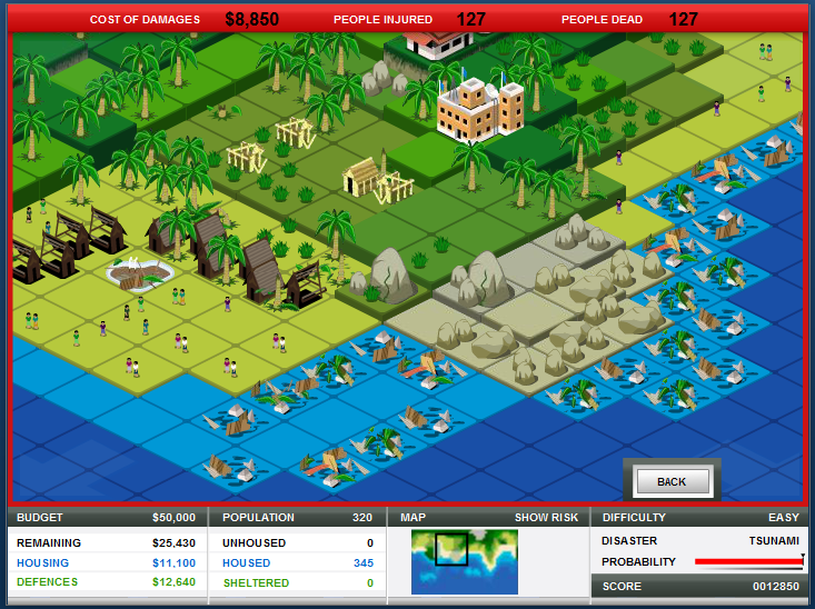
I tried out a few more simulations, but I've found that the game itself isn't very helpful with providing you information as to how to 'win'. I only slowly realized what I was doing wrong through failing over and over again. The main things to note are:
- Check your Overview tab to make sure you're completing all of your objectives.
- Pay attention to where you are placing your buildings and defenses.
- And finally, A LOT of structures can be upgraded. Most important building to upgrade is the Community Center.
If you're interested in trying out the simulation, I'll link it below. Good Luck, and Have Fun!
http://www.stopdisastersgame.org/en/home.html
9/18/2012-9/20/2012
For today's lab, we're being introduced to ArcGis, which is a geographical database program often used to make data maps. Below is a data map I created which is focused on where tornados are predicted to occur vs. where they have historically happened.

Theres a problem here with displaying the prediction path, so I'll show you a rough estimate as to where it was supposed to be showing up in blue:

The multi-colored dots are all of the historical locations of tornados and they provide the best complexity based approach data to prepare and deal with tornado hazards in the future.
10/23/2012
For our fourth lab, we've been studying drought in the US. Below is a map I made that details the predicted drought forcast from September through November of this year.

The Data on the map is from the Palmer Drought Severity Index Forcast: September - November based on NSIPP 7 month weather forcast.
Now here's a map of the locations of crop yields (in calories) in the US. The thing is, the highest yielding areas(in light green) are mostly in areas of Mollisols soil. They are also the areas being hit the hardest by the drought.

10/30/2012
Below is a map of Northridge showing the relationship between ground liquidation and building damage from earthquakes. The ground liquidation areas are in green, yellow, and red, and they are underneath the blue areas of building damages, the darker the blue, the greater the damage.

Here's a map of the PGA(peak ground acceleration) and how it relates to the building damages. the whiter the area, the higher the PGA.

11/06/2012
For this week's lab, we are working with volcanoes! Here's a map with the Top 5 volcano locations in the world:

The Top 5 countries are in red, but they are in the following order: Indonesia, Japan, the US, Russia, and Italy.
For the next part of the lab we are going to start working with 3D maps. Here is the boring map we're starting with:

Now here we have a 2D version of a 3D map of the same Mount Rainier as shown above. This time we can see where the lahar flows are in relation to the topography. The white in both images is snow, which, when it melts, becomes one of the main reasons for the lahar's occurance.

Here are some more before and afters:

Finally, here is a map of the total volume of the area that was lost as a result of the eruption:

11/13/2012
For this week's lab, we've been working with mass wastage. Things like landslides. We've also been experimenting more with elevations and other tools in ArcMap.
Here's a map of elevation and slope in an area of California where a large storm hit in 1999.

The following is a map of the same area and year, which shows how, when parcels were added as a preventative matter for landslides, created a whole new problem by changing the flow of a nearby stream and putting nearby houses in danger.

11/29/2012
Today in lab we are flooding a virtual Eau Claire, WI. The following is a mapped example showing the floodplain of a 100 year flood in Eau Claire. Just to clarify, a 100 year flood does not mean it happens every 100 years. It refers to the fact that there is a 1/100 year chance of a flood like this occurring. Essentially, it's a 1% chance flood.

In this map, the pink shapes are the buildings of the University of Wisconsin, Eau Claire Campus. The red lines are the zones set by FEMA/EC for the projected flood plain of a 100 year flood. The blue is the actual 100 year flood.
12/4/2012
Today in lab we're doing two things, first of which looking at Coastal Flooding; in this case, with tsunami related flooding in the Oxnard area of California. In the following map, the large green area is the tsunami inundation zone, and the red dots mark the locations of the faculties(schools, emergency centers, & medical centers) at risk for tsunami related coastal flooding.

The second part of the lab was the analysis of hurricane storm surges on affected populations, in this case, Florida. The following map shows the affect of a category 3 hurricane storm surge as it hits Collier County, Florida. In the darker the purple areas, the deeper the water is there. In the blocked out sections, the darker the blocks, the denser the population.

No comments:
Post a Comment